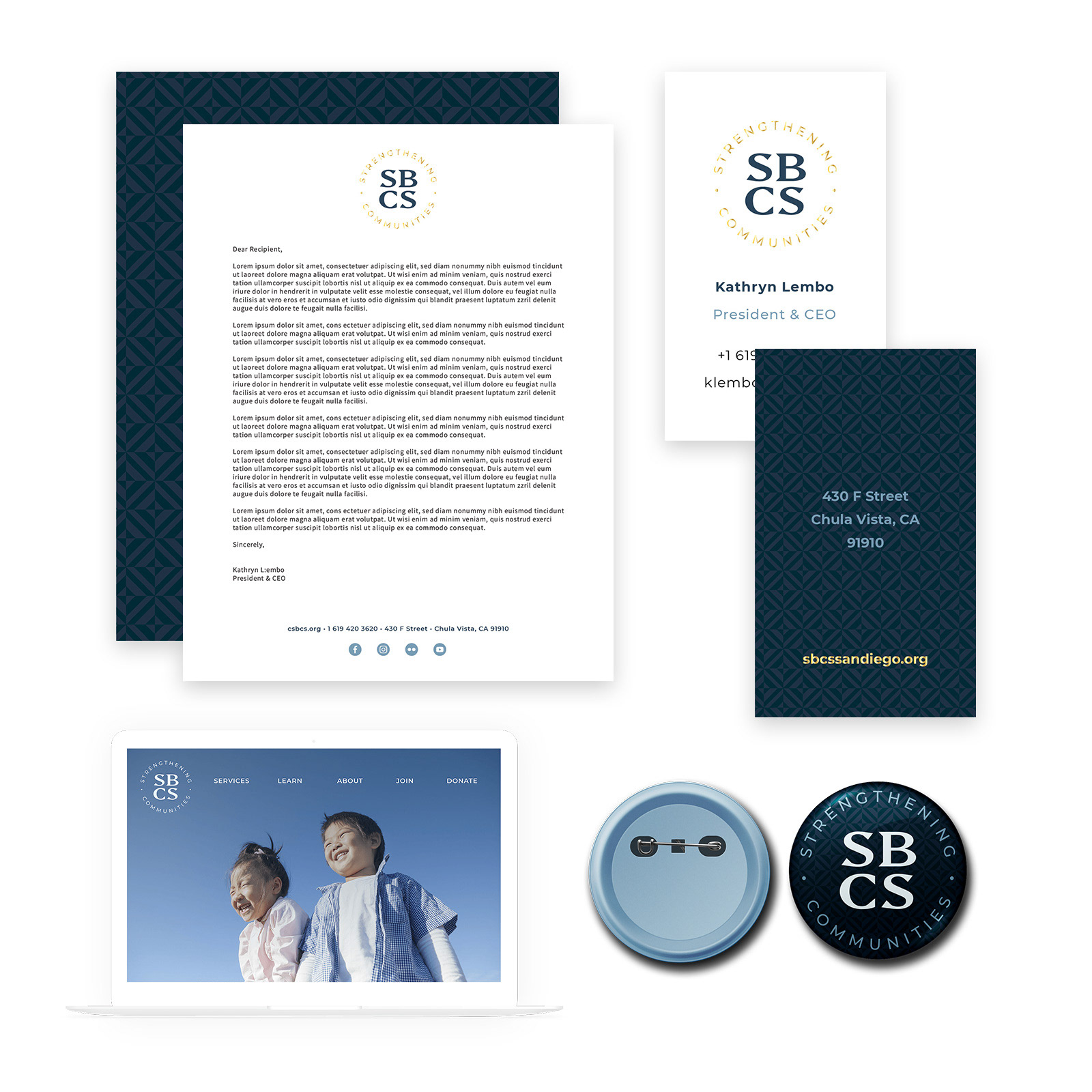
The client, a family and community services nonprofit based in San Diego, CA, needed a visual identity refresh after making the decision to abbreviate their former name to SBCS. It was important to the client that the new brand be simple and classic, and that it act as a complement to powerful photographs of the people they serve.